Optimising Seeks ad design through experimentation
2 weeks (research & design)
Research, visual design
Lead Designer, Manager

The successful variant increased yield by 5.3%
problems
Seeks long-standing ad product design had resulted in users exhibiting 'auto-pilot' behaviour
Adoption metrics for performance and premium products hadn't changed despite extensive experimentation to improve the inclusions and pricing.
Over 50% of SME users interviewed in past research stated they didn't have clear performance expectations for any of Seeks products.
Metrics indicated that users were just defaulting to the cheapest product without considered higher-value, better fit alternatives for their hiring needs.

opportunity
How can we capture user attention to communicate value and break users selection 'inertia'?
Our teams ingoing hypothesis was that we could be doing a significant amount more to drive our users to consider higher-value products. We had the constraint of only utilising the existing data points and features available in the current experience, but with flexibility to re-structure their presentation altogether.
5% increase in performance ad adoption
Increase consideration of higher value products by 15%
Ad mix (percentage of different product types purchased)
Time on spend on selection page per user
process
Breaking down the problem, quickly & succinctly
Through cross-functional workshops as well as 8 qualitative research sessions run over 2 days, we landed on 3 key themes that were driving the observed behaviour.
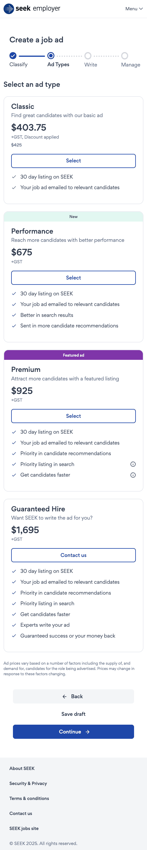
Existing ad selection design
Next I focused on a fast and structured exploration looking at numerous different approaches to design existing ad content in a way that clearly communicated value and resonated with users.

Existing ad selection design
Design explorations
Final designs
Different approaches to communicating value
A key part of preparing for on-platform experimentation was ensuring both variants were clearly differentiated. I emphasising different elements within the product hierarchy across both variants to ensure we could understand specifically what moved the metrics.


Variant 1: Targeted tagline, simplified layout
By emphasising value through a simpler title (explaining how the product will meet the hirers need) and by teasing additional inclusions we will encourage more interaction of comparison of products, therefore increasing awareness of higher value products
Variant 2: Strong visuals, display inclusions and exclusions
Prominent visualisations will allow for stronger, more salient communication of value. Showing exclusions would also help in articulating what a user is missing by not considering higher value products.
Results
Relevance and simplicity best resonated with users
We had some exciting results with Variant 1 increasing performance ad adoption by 5.2% and time on page by 20% per visit. This outcome was a fantastic demonstration of the power of user-centred thinking, and has meant the team can isolate specific changes like hierarchy, composition and copy and directly point to their impact on business success.